Gallagher
Category
Enterprise SaaS / Insurance
Case Study
Role: UI/UX Designer, Audit & Analysis..
Sector: Enterprise SaaS / Insurance.
Arthur J. Gallagher & Co. (Gallagher) is one of the world's largest insurance brokerage and risk management firms, operating across 130+ countries. The Gallagher Client Portal is a global-facing SaaS product that gives enterprise clients real-time visibility into their insurance policies, claims, compliance documents, and risk data — all in one place.
While Gallagher already operated a corporate design system for its internal tools and marketing surfaces, the Client Portal required its own purpose-built design system — one tuned specifically for data-dense enterprise SaaS, complex user roles, global accessibility compliance, and seamless integration with engineering pipelines.
I was brought in as Lead UI/UX Designer to own this end-to-end: from system architecture through component delivery, WCAG remediation..

1. The Problem
Why a separate Design System?
Gallagher's existing corporate design system was built for marketing and internal HR tools — not for complex, data-heavy SaaS applications. Using it directly in the Client Portal created significant friction:
Inconsistent component behavior across enterprise data tables, filters, and multi-step workflows.
No accessibility baseline — the portal scored 65% on automated WCAG audits, blocking enterprise clients in regulated industries
Design-to-development bottlenecks — no standardised tokens or component specs meant engineers rebuilt UI from scratch each sprint
No shared design language for the portal's unique needs: role-based dashboards, bulk data actions, complex form flows, real-time status displays
Team of 6 designers with no unified workflow — inconsistent Figma structure, duplicate components, and high rework rates
The goal: design a system from the ground up that the Client Portal team could own, scale, and hand off to engineering with zero ambiguity.
2. Design System Architecture
The system was structured in four layers — a deliberate architecture decision to ensure that changes at the foundation level propagated automatically through every component, and that engineers always consumed tokens rather than hard-coded values.
2.1. The Four-Layer Architecture
Layer | Name | What it contains |
|---|---|---|
L1 | Global Tokens | Primitive values — raw color palette (hex), typographic scale (rem), spacing units (4px base grid), elevation levels, border radii. These are never consumed directly by UI. |
L2 | Semantic Tokens | Purpose-mapped aliases — color. surface. primary, color. status. danger, spacing.component.md, elevation. card. These are what components consume. |
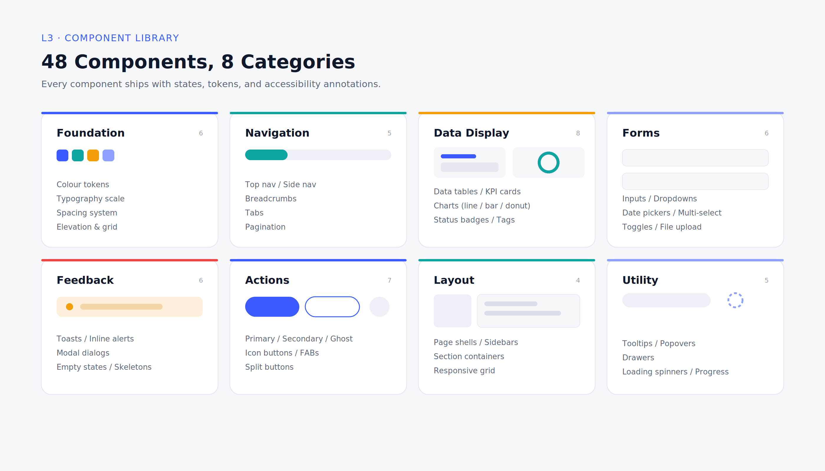
L3 | Component Library | 50+ Figma components built from semantic tokens — buttons, inputs, tables, modals, cards, charts, and nav patterns. Each documented with usage rules and accessibility annotations. |
L4 | Page Templates | Pre-built dashboard, list-view, detail-view, form flow, and empty-state templates built from L3 components. New feature teams start from templates, not a blank canvas. |
2.2. Key Architecture Decisions
8px spacing grid — all spacing values multiples of 8px, enforced as tokens. Eliminated the "pixel nudging" that caused design-dev drift.
Semantic token naming — components never reference primitive hex values. Changing the brand accent updates every component in one token change.
Dark / light mode ready — semantic tokens map to both themes from day one; no component rework needed to add theming later.
Figma variables + code parity — token names in Figma match CSS custom properties consumed by engineering. No translation layer, no drift.
Role-aware component states — components built with admin, read-only, and edit states baked in, reflecting the portal's multi-role permission model.
3. Component Library
The component library was delivered in phases over the first 6 months. Every component shipped with: Figma source file with auto-layout, interaction variants, and all states (default, hover, focus, disabled, error); semantic token annotations; accessibility annotations (focus order, ARIA roles, contrast ratios); and a usage-guideline page with do/don't examples.
Category | Components Delivered |
|---|---|
Foundation | Color tokens, Typography scale, Spacing system, Elevation/Shadow, Grid |
Navigation | Top nav, Side nav, Breadcrumbs, Tabs, Pagination |
Data Display | Data tables, KPI cards, Charts (line/bar/donut), Status badges, Tags |
Forms | Input fields, Dropdowns, Date pickers, Multi-select, Toggles, File upload |
Feedback | Toast notifications, Inline alerts, Modal dialogs, Empty states, Skeletons |
Actions | Primary / Secondary / Ghost buttons, Icon buttons, FABs, Split buttons |
Layout | Page shells, Sidebars, Section containers, Responsive grid |
Utility | Tooltips, Popovers, Drawers, Loading spinners, Progress bars |
Component governance
Contribution model: any designer could propose a new component via a defined RFC (Request for Component) process.
Review gate: all new components reviewed by me against accessibility, token compliance, and naming convention before merging.
Versioning: Figma library versioned using semantic versioning labels (v1.0, v1.1, v2.0). Breaking changes communicated to team via changelog doc.
Dev handoff: Figma Dev Mode + annotated component specs. Developers had all measurements, token names, and interaction notes without asking.
4. Accessibility Audit & Remediation (WCAG 2.1)
4.1. The Starting Point: 65%
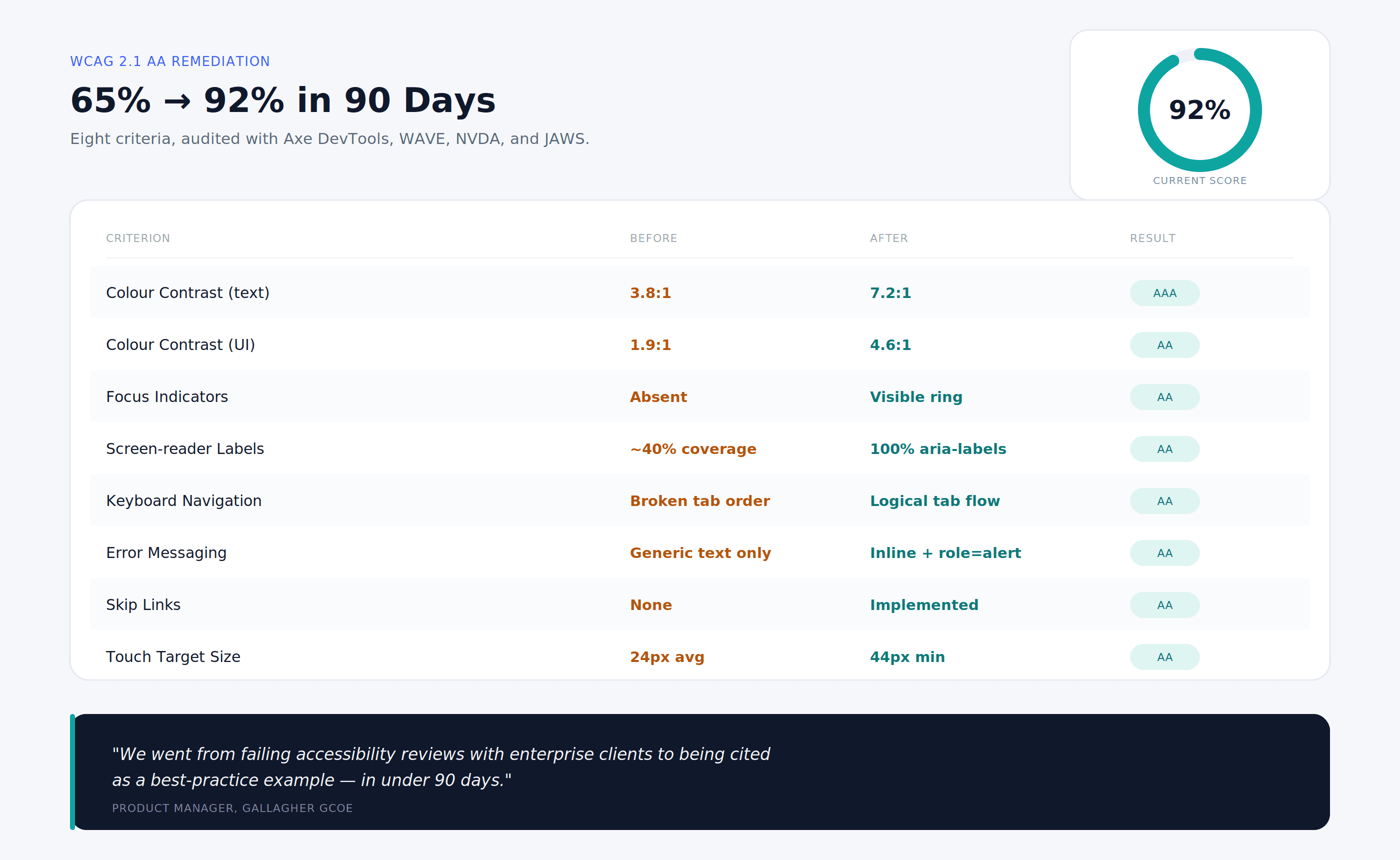
Before the design system work began, I ran a full WCAG 2.1 Level AA audit on the existing Client Portal using a combination of automated scanning (Axe Dev Tools, WAVE) and manual keyboard and screen-reader testing (NVDA + JAWS). The portal scored 65% — failing primarily on color contrast, focus management, and missing semantic labels.
4.2. WCAG Remediation Table
Criterion | Before | Status | After | Status |
|---|---|---|---|---|
Color Contrast (text) | 3.8:1 | Fails AA | 7.2:1 | Passes AAA |
Color Contrast (UI) | 1.9:1 | Fails AA | 4.6:1 | Passes AA |
Focus Indicators | Absent | Fails | Visible ring | Passes AA |
Screen-reader Labels | ~40% coverage | Partial | 100% aria-labels | Passes AA |
Keyboard Navigation | Broken tab order | Fails | Logical tab flow | Passes AA |
Error Messaging | Generic text only | Partial | Inline + role=alert | Passes AA |
Skip Links | None | Fails | Implemented | Passes AA |
Touch Target Size | 24px avg | Fails AA | 44 px min | Passes AA |
4.3. How We Reached 92% in 3 Months
Month 1 — Audit & triage: Categorised all failures by severity (critical / major / minor) and assigned to component owners. Fixed all critical contrast failures first.
Month 2 — System-level fixes: Rebuilt colour tokens from scratch using APCA contrast algorithm. All semantic colour tokens verified against AA thresholds before entering the system.
Month 2–3 — Component rebuild: Buttons, inputs, modals and nav patterns rebuilt with correct focus rings (3px offset, 2px solid), logical tab order, and full ARIA labelling.
Month 3 — Re-audit & gap close: Re-ran full automated + manual audit. Remaining 8% represents complex third-party chart components pending vendor update.
Ongoing: Every new component requires accessibility sign-off before entering the library. WCAG checklist built into component RFC template.
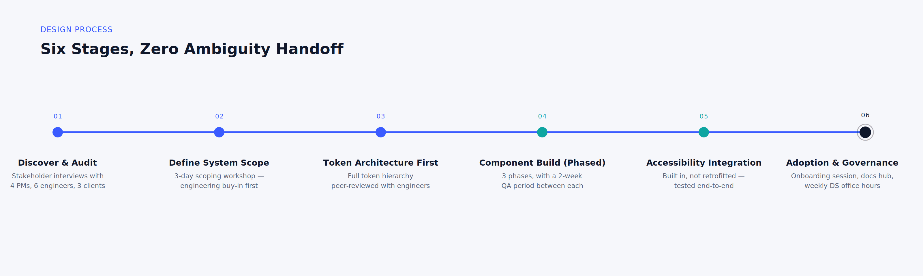
My Design Approach
Stage 1 — Discover & Audit
Audited the existing portal for component inconsistencies, design-dev drift, and accessibility failures. Conducted stakeholder interviews with 4 PMs, 6 engineers, and 3 enterprise client representatives to map real usage patterns and pain points in the current portal experience.
Stage 2 — Define the System Scope
Ran a 3-day collaborative scoping workshop with the design team and engineering leads to agree on system boundaries, component priority, naming conventions, and the contribution model. This prevented scope creep and got engineering buy-in before a single component was drawn.
Stage 3 — Token Architecture First
Built the entire token hierarchy before touching components. This forced clarity on decisions that would otherwise be made inconsistently at the component level — brand colours, spacing rhythm, elevation model, type scale. All tokens were peer-reviewed with 2 senior engineers before being formalised.
Stage 4 — Component Build (Phased)
Components delivered in 3 phases: foundation → data display → complex interactions. Each phase had a 2-week QA period with the engineering team before the next phase began. This prevented the "big bang" launch risk where dozens of untested components land in production simultaneously.
Stage 5 — Accessibility Integration
Accessibility was not a retrofit — it was integrated into the component build process. Every component had an accessibility checklist in Figma before it was handed off. I personally reviewed the first 12 components end-to-end with screen-reader testing, then trained the team to run their own checks.
Stage 6 — Adoption & Governance
Ran a 2-hour system onboarding session with the full design team and key engineering stakeholders. Created a Notion-based documentation hub with usage guides, do/don't examples, token reference, and a changelog. Set up a weekly "DS office hours" slot for questions and contribution proposals.
4. Team Leadership & Mentorship Structure
Leading a team of 6 designers through a design system transition required more than just building components — it required building capability. Most of the team had never worked on a formal design system before. My mentorship approach was structured around making the system intuitive enough that designers wanted to use it, and rigorous enough that engineers could trust it.
Initiative | Description |
|---|---|
Design Crits (Weekly) | 1:1 feedback on in-progress work against DS standards and WCAG criteria |
Component Ownership | Each designer owned 1–2 component categories; reviewed PRs before Figma handoff |
WCAG Study Sessions | Bi-weekly accessibility workshops using real audit failures as teaching material |
Token Documentation Sprints | Paired sessions to write usage guidelines and do-not-do annotations |
Engineering Syncs | Rotational attendance at dev standups to build cross-functional vocabulary |
Growth Plans | Quarterly goals per designer tied to DS quality, delivery speed, and accessibility scores |
Team outcomes
Delivery speed improved 20% within the first quarter post-system launch
Feedback and revision cycles reduced by 30% through clearer component specs and usage guidelines
All 6 designers now independently contribute and review components against the DS standards
2 designers now lead their own accessibility reviews end-to-end without escalating to me
Team NPS (internal) increased significantly after removing the ambiguity of "what component should I use?"